


There’s a handy summary of RBA economic data available to click on – and at the moment it’s a very reassuring thing to do.
Every day we seem to be bombarded with economic data. It can feel confusing and overwhelming, but the Reserve Bank Australia has your back.
At the end of each month it wraps up the key headlines in a series of infographic snapshots. David Koch mentioned in his newsletter this week that he “always look forward” to the infographics. They provide a neat summary of RBA economic data in easy-to-digest format.
The monthly infographics cover the following areas:
Here are the latest infographics, with the observations David Koch outlined in his newsletter.
Key Economic Indicators
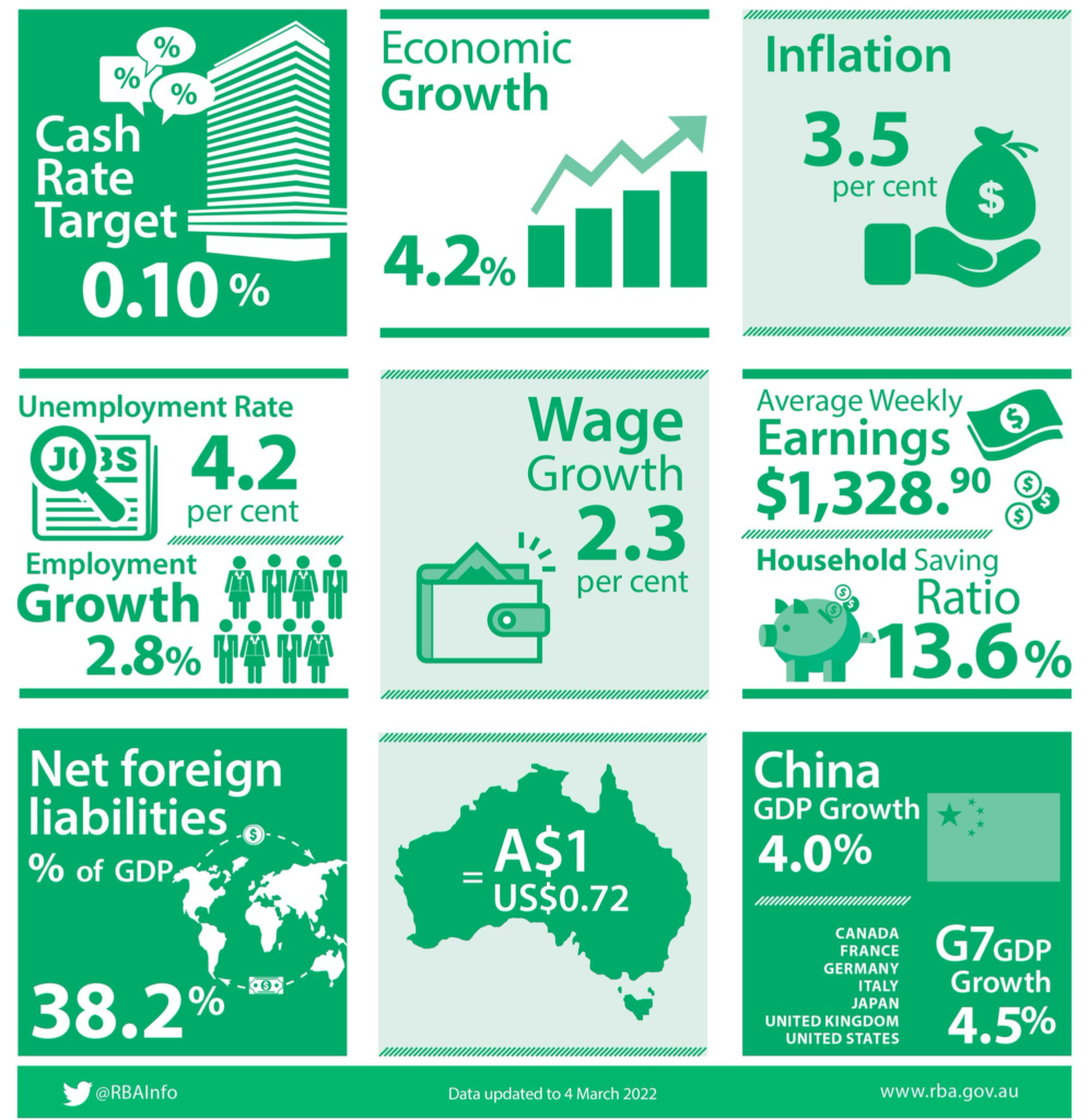
Source: Reserve Bank Australia, Key Economic Indicators
- Our economic growth is about on par with China and the G7 group of major industrial countries – so going pretty well.
- There is an ongoing jobs shortage with low unemployment and solid jobs growth. Basically there is a job for anyone who wants to work.
- You hear a lot about how high our foreign debt is, but even after all the economic stimulus, it is still the equivalent of just 38 per cent of the total value of our economy. Compared with our major trading partners, that is still very low. Plus, we’ve borrowed extra at record low interest rates.
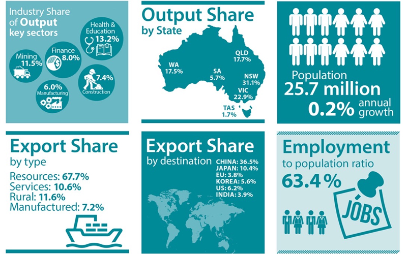
Composition of the Australian Economy
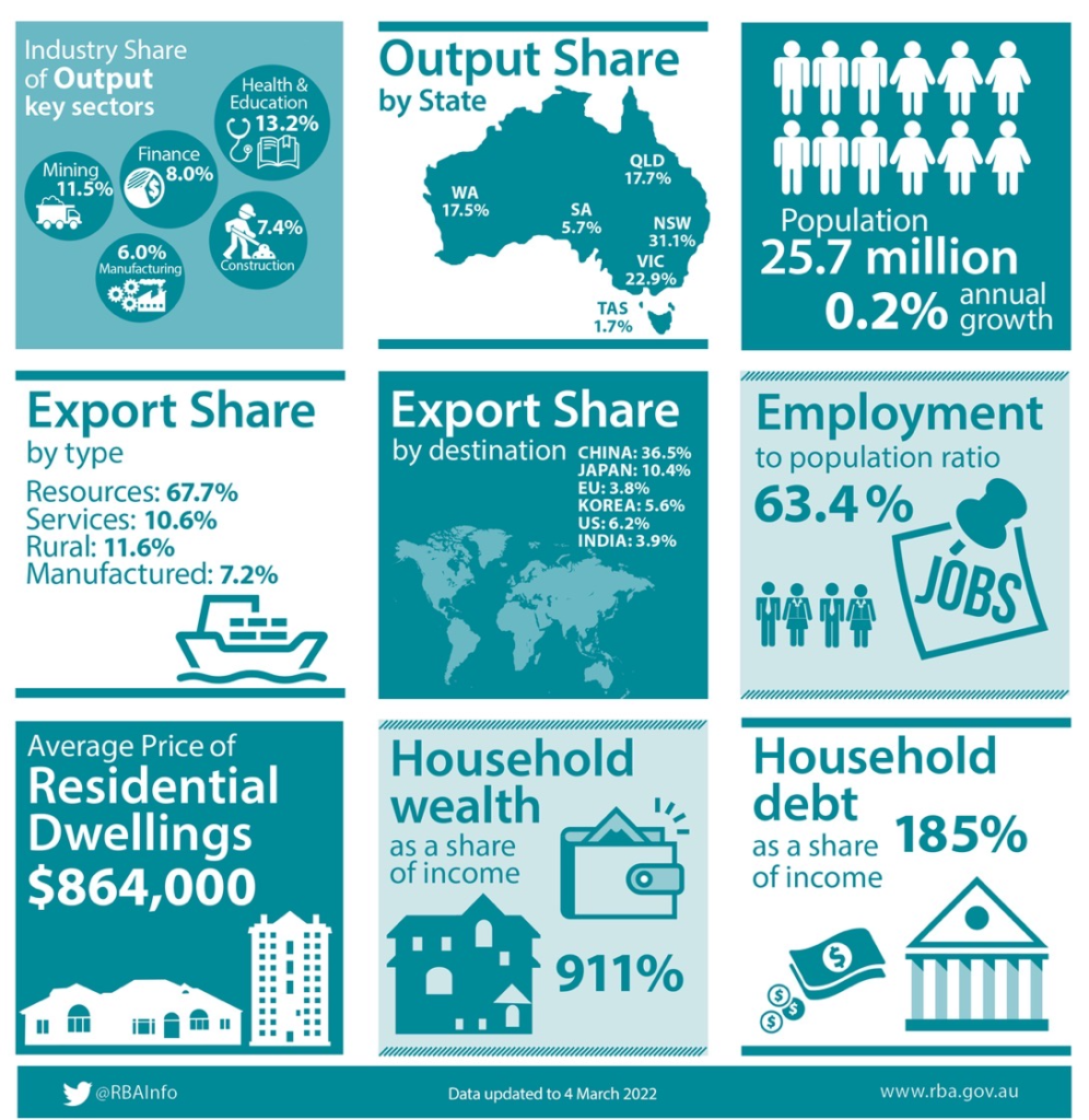
Source: Reserve Bank Australia, Composition of the Australian Economy
- Education and Healthcare is the biggest sector of the economy (even bigger than mining), while NSW is Australia’s economic engine room.
- Mining and resources are far and away our biggest exports and, despite the political and trade tensions, China is still by far our biggest export customer. It’s three times bigger than the next customer, Japan.
- Yes, the debt levels of Australian households are high (nearly double income levels), but household wealth is nine times higher than income. So debt levels are high, but they are secured against a high level of assets via homes and superannuation.
- Australians are hard workers. Over 63 per cent of all adults have a job, that’s one of the highest levels in the world.
More infographic summaries worth a look
There are a few other infographics available on the page, but these aren’t updated monthly.
Financial Stability indicators – this is updated periodically, depending on what’s going on both domestically and internationally. The latest update was on 9 April last year, so we’re well overdue an update.
RBA Annual Report – exactly what it says on the tin, a snapshot of what the RBA got up to during the latest financial year.
How Australians Pay – last updated using data from the 2019 Consumer Payments Survey. It will be interesting to see how much the “1 in 20 in-person payments are made with a mobile phone” stat has changed! Also sure to have increased is the “1 in 5 people use BNPL payments” – I reckon that will have sky-rocketed. It’s a triennial survey, so new data should be released this year.
They each provide an interesting snapshot and are well worth taking a look at.
The summary of RBA economic data can be really reassuring
Another interesting exercise is using the ‘snapshot comparison’ tool available for the two monthly infographics. It allows you to compare the snapshot at two different periods of time, or by two important events in Australian history.
For example, take a look at the comparison between the latest RBA data (February 2022) and the early 1990s recession.
- The cash rate target in 1991 was at an astonishing 12 per cent (compared to 0.10 per cent at the moment).
- GDP growth was at -1.1 per cent compared to 4.2 per cent in December 2021.
- Unemployment was at 9.2 per cent (it’s less than 4.22 per cent right now).
And the adjusted inflation rate stood at 5.5 per cent – it was around 3.5 per cent at the end of last year.
The comparison is a reassuring one, no matter what statistic you look at. For instance, today’s households are saving more than double compared to those in March 1991. We’re also twice as wealthy.
I urge you to take a deep-dive into the summary of RBA economic data via these handy infographics and comparisons. At the moment it’s both an interesting and very reassuring exercise.